# 노트북 계열 장점 : 코드 + 문서 + 결과(그래프)
# ==> 명시적으로 아래 결과창에 그래프를 보여주세요! 옵션!!!
%matplotlib inline
# --> 개인 pc 하실 때 ,,,그래프 팝업창으로 나타나면서,,이 옵션을 실행!!

import numpy as np
import pandas as pd
참고) 아래 옵션을 수행하면 아래에 그래프가 나타나고, 아니면 창으로 나타남!!
# y = X^2의 그래프 생성을 위해서. --> 10개 구간으로 하기 위해서는 11로 처리해야 함! 구간이므로!!!
x = np.linspace(start = 0, stop = 10, num=11)
y = x ** 2

print(x)
print(y)
'''
[ 0.  1.  2.  3.  4.  5.  6.  7.  8.  9. 10.]
[  0.   1.   4.   9.  16.  25.  36.  49.  64.  81. 100.]
'''

# 파이썬 계열에서 가장 기본적인 그래프 그리는 패키지
# matplotlib
# ==> 기본이 되는 패키지인 하지만,,,안 이뻐요;;;
#     그냥 간단히 볼 떄!!!! 발표자료,,,,그닥입니다..
# ==> ML/DL 에서 실제 데이터 분포/ 이상치 이런거 파악에 용이..
#     중간중간에 사용하면서 코드를 처리하는 경우가 많이 있습니다.
#     +++ 이미지 데이터 체크..어쩔?????
import matplotlib
import matplotlib.pyplot as plt
# 파이썬 계열에서 주로 사용하는 그래프 패키지들
# 1) matplotlib
# 2) seaborn : r 시각화 느낌을 주는 친구..
# 3) plotly : 동적으로 보여줄 때
# +++ 지도 follium 패키지 등등등;.........
# +++ 나의 포폴/ 시각적인 부분이 중요한 자료 : 반듯히 전문 BI롤 하시는 것을
#                                              추천합니다!!
# *** 개인EDA 발표에서도 무조건 테블로 그래프를 그려서 하세요!!!

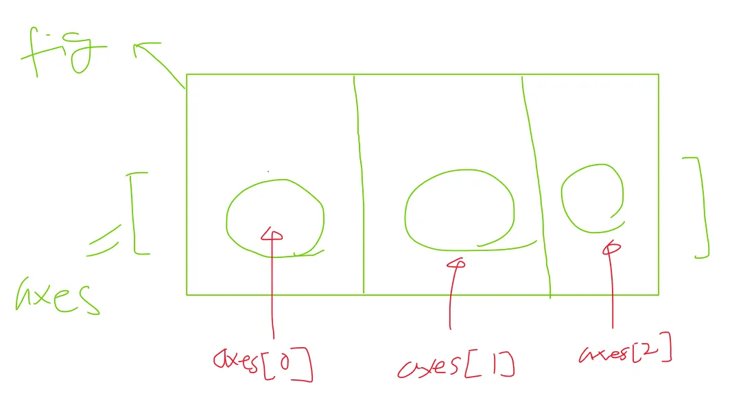
# 01) 그래프의 위치 지정해서 그리는 방법
# ==> 그릴 판 -> 그릴 영역 --> 순서쌍을 찍어야 함!! --> 기타 꾸밈에....
# *** 경우에 따라서 코드가 생략이 이루어질 수 있음!!!!!

# 그릴 준비 : 판을 준비!!!
fig = plt.figure()

# 그림을 위치할 위치에 대한 포지션 지정
# ==> 구체적인 그림 그릴 곳/영역 : ax, axes
#axes = fig.add_axes([0.5, 0.5, 0.5, 0.5]) # left, bottom, width, height [0 ~ 1]
axes = fig.add_axes( [0.5, 0.5, 0.5, 0.5 ])
# left, bottom, width, height [0 ~ 1]

# 실제 데이터를 표기 - X데이터, y데이터, 그릴 옵션 [여기서는 red로 그리겠다는 의미]
axes.plot( x,y , "r") # ***** ==> 갯수나 모양이 안 맞으면 쪽 남!!!
# <https://matplotlib.org/stable/gallery/color/named_colors.html#sphx-glr-gallery-color-named-colors-py>

# 기타 옵션 표시
# 01) x축 이름
axes.set_xlabel("X")
# 02) y축 이름
axes.set_ylabel("Y")
# 03) 그래프 제목
axes.set_title("MyGraph")
Text(0.5, 1.0, 'MyGraph')


#  안에 그래프 넣기
fig = plt.figure()

# 메인 그래프와 안에 그릴 작은 그래프에 대한 위치 설정
# 아래의 위치에 대한 정보를 변경하면, 각기 그래프들의 위치가 변경됨!!
axes1 = fig.add_axes([0, 0,1,1])# 메인 그래프 위치
axes2 = fig.add_axes([0.1, 0.5, 0.4, 0.3]) # 안에 그릴 그래프 위치

# 메인 그래프
axes1.plot( x,y, "r")
axes1.set_xlabel("X")
axes1.set_ylabel("Y")
axes1.set_title("MainGraph")

# 안에 그릴 그래프
axes2.plot( y,x, "g")
axes2.set_xlabel("Y")
axes2.set_ylabel("X")
axes2.set_title("subGraph")
Text(0.5, 1.0, 'subGraph')

# 02) 그래프의 위치 지정하지 않고, 분할해서 그리는 방법

# 분할을 1개로 처리
fig, axes = plt.subplots() # --> 그냥 1개로 사용하겠다...
# ==> 전체 판과 주문한 그릴 영역들에 대한 구체적인 영역들에 대한 변수..
axes.plot(x,y,"r")
[<matplotlib.lines.Line2D at 0x799c3408dc70>]

# 여러개의 크기로 분할.
fig, axes = plt.subplots(nrows=1, ncols=3)
axes
array([<Axes: >, <Axes: >, <Axes: >], dtype=object)

# 여러개의 크기로 분할.
fig, axes = plt.subplots(nrows=1, ncols=3)

i=0
for ax in axes:
    ax.plot(x, y+(i*10), 'r')
    ax.set_xlabel('x')
    ax.set_ylabel('y')
    ax.set_title('title'+str(i))
    i = i+1

# 위와 같은 경우에서 plt.subplots(nrows=2, ncols=4)로 변경하려면??
# 앞에서와 같이 하면 에러가 발생한다.
# 이를 탐색하기 위해서는 아래와 같은 샘플 코드를 돌려보면서 확인
fig, axes = plt.subplots(nrows=2, ncols=3)
for a in axes: # --> 가로줄..
    for b in a: # ---> 몇 번째 세로줄...
        print(a)
        print(b)
[<Axes: > <Axes: > <Axes: >] Axes(0.125,0.53;0.227941x0.35) [<Axes: > <Axes: > <Axes: >] Axes(0.398529,0.53;0.227941x0.35) [<Axes: > <Axes: > <Axes: >] Axes(0.672059,0.53;0.227941x0.35) [<Axes: > <Axes: > <Axes: >] Axes(0.125,0.11;0.227941x0.35) [<Axes: > <Axes: > <Axes: >] Axes(0.398529,0.11;0.227941x0.35) [<Axes: > <Axes: > <Axes: >] Axes(0.672059,0.11;0.227941x0.35)

# 위의 문제 해결방법
fig, axes = plt.subplots(nrows=2, ncols=3)

i=0
for ax1 in axes:
    for ax2 in ax1:
        ax2.plot(x, y+(i*10), 'r')
        ax2.set_xlabel('x')
        ax2.set_ylabel('y')
        ax2.set_title('title'+str(i))
        i = i+1

# 자동적으로 간격 등 알맞게 배열해주는 옵션
fig, axes = plt.subplots(nrows=2, ncols=3)

i=0
for ax1 in axes:
    for ax2 in ax1:
        ax2.plot(x, y+(i*10), 'r')
        ax2.set_xlabel('x')
        ax2.set_ylabel('y')
        ax2.set_title('title'+str(i))
        i = i+1
fig.tight_layout()
# ==> 개별 그래프가 아니라,,,전체 판fig에서 그래프 위치들을 조정!!!
#     적용이 구체적인 그릴 영역이 아니라 전체  판에다가 적용!!!!!!!

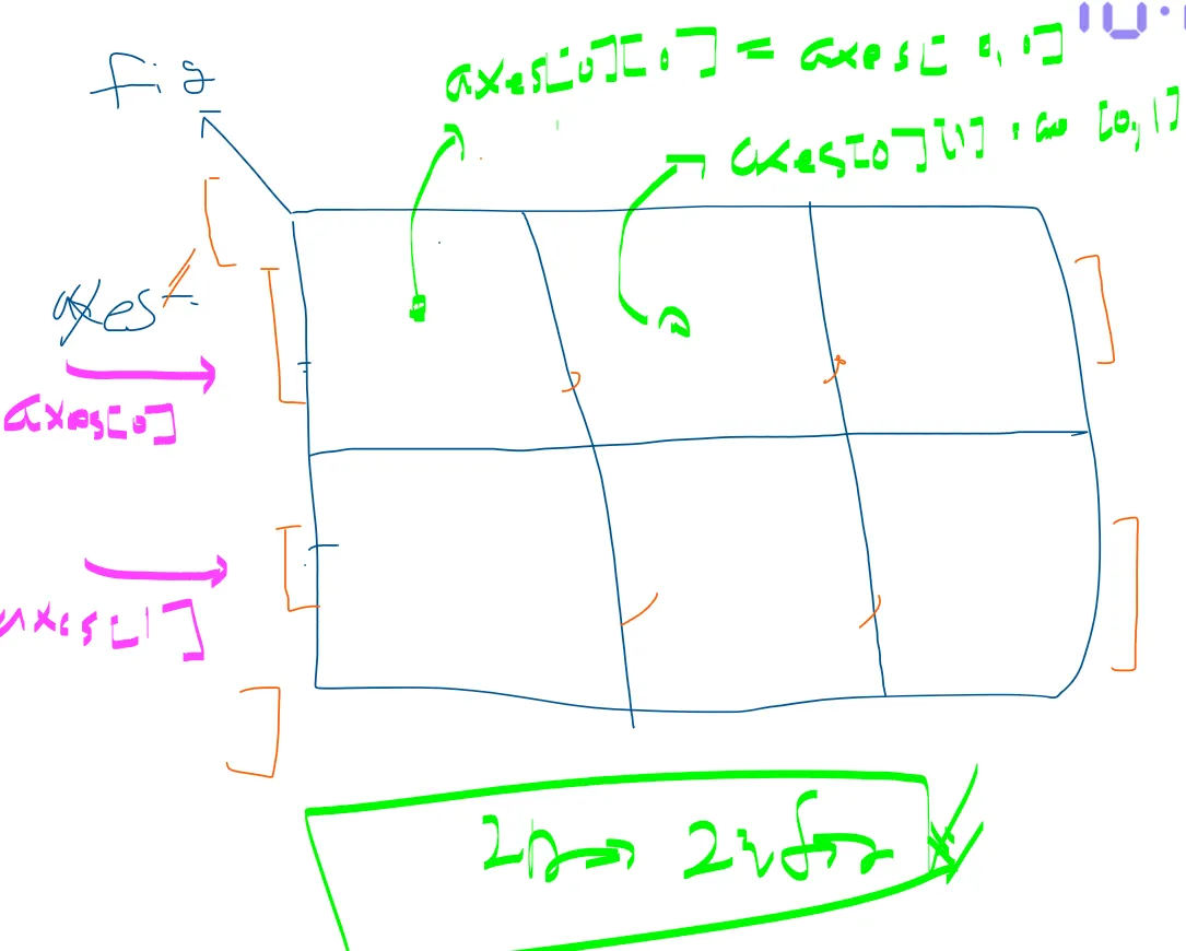
# 구체적으로 인덱스로 접근하는 방법 : nrow=1이면 1차원, nrow>=2이면 2차원으로 처리해주어야 함.
fig, axes = plt.subplots(nrows=2, ncols=2)
# fig : 전체 그릴 판
# axes ==> 2 by 2에 대한 전체 4개에 대한 구체적인 그릴 영역 2차원 Array
#          a[0][0] == a[0,0]

# 그림 0-0
axes[0][0].plot(x, x**2, x, x**2 + 100)
#axes[0][0].plot(x, x**2)
#axes[0][0].plot(x, x**2+100)
axes[0,0].set_title("axes 0 0")

# 그림 0-1
axes[0,1].plot(x, x**2)
axes[0,1].set_title("axes 0 1")

# 그림 1-0
axes[1,0].plot(x, x**3)
axes[1,0].set_title("axes 1 0")
# X/Y축의 범위 지정
axes[1,0].set_xlim( [2,4] )
axes[1,0].set_ylim( [10,40] )

# 그림
axes[1,1].plot(x, x**2, x, x**2+1000)
# y축 로그
axes[1,1].set_yscale("log")
axes[1,1].set_title(" log - axes")

fig.tight_layout()

# 위에서는 위치 정도만 지정할 수 있었는데, 구체적인 크기 및 dpi등을 조절해보자.
# DPI : dot per inch

# 해상도 : 1200 * 600 픽셀을  생성해보자
fig = plt.figure(figsize=(12,6), dpi=100) # 1판 주문

# 해상도가 아니라 크기임!!!
#fig, axes = plt.subplots(figsize=(12,6))
fig, axes = plt.subplots(figsize=(3,3)) # 1판을 여러개로 주문,,,그 부분은 skip

axes.plot(x, y, 'r')
axes.set_xlabel('x')
axes.set_ylabel('y')
axes.set_title('title');
<Figure size 1200x600 with 0 Axes>

# 그래프를 그림으로 저장하기
# 저장하고자하는 경로 및 파일이름 지정 :
# 참고) 파일형식 : PNG, JPG, EPS, SVG, PGF, PDF
outPath = "matOutPic.png"
# dpi 는 지정하지 않아도 됨.
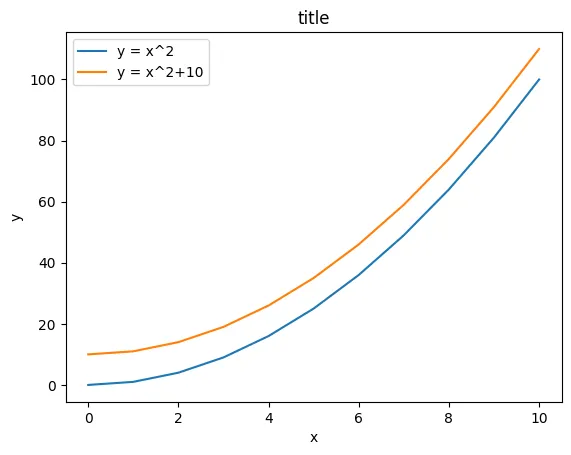
fig.savefig(outPath, dpi=200)# 범례 추가
fig, ax = plt.subplots()
# 2개의 그래프 작성
ax.plot(x, x**2 , label="y = x^2")
ax.plot(x, x**2 + 10, label="y = x^2+10")
# 범례 위치 옵션
# ax.legend(loc=0) # 알아서 자동적으로 최적 위치
# ax.legend(loc=1) # 오른쪽 상단
# ax.legend(loc=2) # 왼쪽 상단
# ax.legend(loc=3) # 왼쪽 하단
# ax.legend(loc=4) # 오른쪽 하단
ax.legend(loc=2) # 왼쪽 상단
ax.set_xlabel('x')
ax.set_ylabel('y')
ax.set_title('title')
Text(0.5, 1.0, 'title')
# 기타 옵션으로 꾸미기 : latex의 옵션을 사용할 수 있으나, \\같은 옵션으로 인해서 r을 붙여서 사용해야 함!
# \\alpha ---> r \\alpha 등으로 처리해줘야 함.
fig, ax = plt.subplots()

ax.plot(x, x**2, label=r"$y = \\alpha^2$")
ax.plot(x, x**2+10, label=r"$y = \\alpha^2+10$")
ax.legend(loc=2)
ax.set_xlabel(r'$\\alpha$', fontsize=15) # --> latex
ax.set_ylabel(r'$y$', fontsize=30) # --> latex
ax.set_title('title') # --> matplot 기준 쌩 문자열로
Text(0.5, 1.0, 'title')

fig, ax = plt.subplots()

ax.plot(x, x**2, label="$y=x^2$") # X^2 ==> X 2는 위첨자..--> r은 보면서 추가/빼거나,,
ax.plot(x, x**2+10, label="$y=x^2+10$")
ax.legend(loc=2)
ax.set_xlabel(r'$\\alpha$', fontsize=15)
ax.set_ylabel(r'$y$', fontsize=30)
ax.set_title('title');

# 색상 옵션 : 이름으로 지정 & HEXCode로 지정
fig, ax = plt.subplots()

ax.plot(x, x**2, color="red", alpha=0.5,label="$y=x^2$") # half-transparant red
ax.plot(x, x**2+10, color="#1155dd",label="$y=x^2+10$") # Blue계열 hex 코드
ax.plot(x, x**2+20, color="#15cc55",label="$y=x^2+20$") # Green 계열 hex코드
ax.plot(x, x**2+30, color="blue", alpha = 1,label="$y=x^2+30$")
ax.plot(x, x**2+40, color="blue", alpha = 0.1,label="$y=x^2+40$")

ax.legend(loc=2)
ax.set_xlabel(r'$x$', fontsize=15) # --> text를 하는 과정에서는 fontsize 지정!
ax.set_ylabel(r'$y$', fontsize=30)
ax.set_title('title');

# 선과 점 표시 관련
fig, ax = plt.subplots(figsize=(10,20))

# 선의 두께 관련 : linewidth ==> lw
ax.plot(x, x**2, color="blue", linewidth=0.10)
ax.plot(x, x**2+5, color="blue", linewidth=0.50)
ax.plot(x, x**2+10, color="blue", linewidth=1.00)

# 선 연결 모양 관련  :  ‘-‘, ‘--’, ‘-.’, ‘:’, ‘steps’
ax.plot(x, x**2+15, color="red", lw=3, linestyle='-')
ax.plot(x, x**2+25, color="red", lw=3, ls=':')

# 점 표시 관련 : +', 'o', '*', 's', ',', '.', '1', '2', '3' 등
ax.plot(x, x**2+30, color="green", lw=4, ls='--', marker='+',markersize=2)
ax.plot(x, x**2+35, color="green", lw=4, ls='--', marker='+',markersize=2)
ax.plot(x, x**2+40, color="green", lw=4, ls='--', marker='o',markersize=4)
ax.plot(x, x**2+45, color="green", lw=4, ls='--', marker='o',markersize=4)
ax.plot(x, x**2+45, color="green", lw=4, ls='--', marker='o',markersize=6, markerfacecolor="red")
ax.plot(x, x**2+45, color="green", lw=4, ls='--', marker='o',markersize=6, markerfacecolor="red",
        markeredgecolor="yellow",markeredgewidth=3)
[<matplotlib.lines.Line2D at 0x799c32ebabd0>]

# *** 코드로 할 때의 장점 : 하나하나 다 컨트롤이 가능한다!!
# ==> 단점 : 귀찮아요;;;
# 그리드 그리기 : nrow=1이니 1차원으로 처리한다.
fig, axes = plt.subplots(1, 2, figsize=(15,8))

# 기본 그리드
axes[0].plot(x, x**2, x, x**2+10)
axes[0].grid(True) # --> 회색 그리드 그려진다.
axes[0].spines['bottom'].set_color('blue')
axes[0].spines['bottom'].set_linewidth(5)

# 그리드 수정
axes[1].plot(x, x**2, x, x**2+100)
axes[1].grid(color='blue', alpha=0.5, linestyle='dashed', linewidth=2)
# --> 그리드도 polt처럼 동일한 명령어들로 꾸밀 수 있다!!!
axes[1].spines['top'].set_color("yellow")
axes[1].spines['top'].set_linewidth(10)
axes[1].spines['left'].set_color("red")
axes[1].spines['left'].set_linewidth(5)
axes[1].spines['bottom'].set_color('blue')
axes[1].spines['bottom'].set_linewidth(20)

# y 양축 그래프
fig, ax1 = plt.subplots()

ax1.plot(x, x**2, lw=5, color="blue")
ax1.set_ylabel(r"measure_1 $(m^2)$", fontsize=10, color="blue")
for label in ax1.get_yticklabels():
    label.set_color("blue")

ax2 = ax1.twinx()
ax2.plot(x, x**1+20, lw=1, color="green")
ax2.set_ylabel(r"measure_2 $(m^3)$", fontsize=30, color="green")
for label in ax2.get_yticklabels():
    label.set_color("green")

# 가장 그래프의 표준적인 plot 메서드
# ==> 순서쌍에 대한 것을 기준으로 다순 점을 찍고,,점과 점을 직선으로 이어준!!
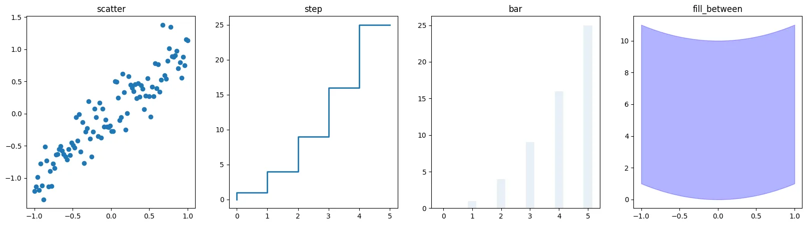
# 기타 그래프 종류들
n = np.array([0,1,2,3,4,5])
x = np.linspace(-1, 1., 100)
# 기본적인 scatter / step / bar / fill_between ==> 그리고자 하는
#                                                  그래프에 대한 메뉴얼
fig, axes = plt.subplots(1, 4, figsize=(20,5))

axes[0].scatter(x, x + 0.25*np.random.randn(len(x)))
axes[0].set_title("scatter")

axes[1].step(n, n**2, lw=2)
axes[1].set_title("step")

axes[2].bar(n, n**2, align="center", width=0.3, alpha=0.1)
axes[2].set_title("bar")

axes[3].fill_between(x, x**2, x**2+10, color="blue", alpha=0.3);
axes[3].set_title("fill_between");
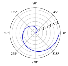
# 극 좌표 그래프
fig = plt.figure()
ax = fig.add_axes([0.0, 0.0, .6, .6], polar=True)
t = np.linspace(0, 2 * np.pi, 100)
ax.plot(t, t, color='blue')
[<matplotlib.lines.Line2D at 0x1142a57f0>]
# 히스토그램
n = np.random.randn(100000)
fig, axes = plt.subplots(1, 2, figsize=(20,5))

axes[0].hist(n)
axes[0].set_title("Default")
axes[0].set_xlim((min(n), max(n)))

axes[1].hist(n, cumulative=True, bins=30)
axes[1].set_title("Cum")
axes[1].set_xlim((min(n), max(n)));

정리
- matplotlib
- 순서쌍을 직접적으로 밀어놓고 그리는 방식!!
- seaborn
- 원천 데이터에서,,이거 ,저거 그려주세요 방식!!( 기본 방식)
-
- 예제 코드
- data=df에서 해당하는 컬럼 중심 설명 하는 식
- 많다...단, 이것만 되는 것은 아님!!
- matplotlib 방식도 가능하기는 함..
- 예제 코드
- ~~ pitvot_table